As part of my role as the Design Lead for the launch of Microsoft’s ambitious Power platform admin center, I took on several complex individual contributor projects. The largest of these projects was the migration of Dynamics app settings from the Dynamics 365 app on a legacy web client to the new Power platform admin center site, using a new information architecture and a new UI stack.
Further complicating the assignment was the timeline presented for the work. Originally, the team had planned on migrating the old settings pages directly to the Dynamics UI stack, the Unified Client. This original plan meant no changes to the information architecture. In late March, that strategy changed – giving me 2 weeks to do the initial analysis and information architecture, and a further 2 weeks to do the first cut at the designs to hand off to developers in early May. The new Settings experience went into private preview in July 2018 and public preview in September 2018, with ongoing work still influenced by the groundwork I laid during my time on the project.
Design problem scope
In summary: explore a wide array of legacy settings placed into the Dynamics 365 UI by multiple teams without documentation. Find a way to improve discoverability and accessibility without breaking the existing Power platform admin center site architecture. This task involved several phases:
- Become an SME for over 100 undocumented settings to fill a product management gap
- Propose a new information architecture which adapted to the necessary location on the site
- Examine the Fabric UI patterns and explore ways to apply the available patterns to our information architecture
- Obtain team buy-in on a preferred first step forward
- Design and redline over a dozen settings pages
The engagement began in the final week of March 2018. Initial handoff to developers was approximately 4 weeks later, with implementation starting in early May. Design work continued in parallel, with several iterative deliveries and updates.
Team
I was the design owner and driver, working directly with my team’s content designer, my team’s researcher, and 1 key PM partner (who left and was replaced halfway through.) I also partnered with a shared design analyst who helped us look at past telemetry (scant as it was). My direct report designers and my PM partner’s peers and manager were reviewers on the ongoing work.
Phase 1: Settings Spelunking
The project brief I received did not specify specific settings; only the pages those settings were on. This wasn’t a sufficient level of documentation, as some of those pages contained dozens of settings from vastly different features. I originally asked our product management partner to obtain documentation for individual settings, but after they declined I took it upon myself to do the work to ensure this new design would have a chance at improving upon the old model.
What I found in the existing interface


The output of my initial investigation
 Screenshot from my initial settings audit, which identified 113 settings in the Administration tab alone.
Once I’d completed this initial phase, I had an Excel spreadsheet of “documentation” upon which I could base my future design work. This document continues to inform the development team, even after my departure months later.
While the primary focus of phase 1 was the Administration L1 group plus a few scattered pages from other L1 groups, I wanted to look at things holistically to ensure my design would solve for future expansions appropriately. Once I completed my look at Administration, I looked across all other L1 pages to determine how deep their tree went. This was critical in helping me later identify which Fabric UI affordances would be most appropriate, and how to group the broader Settings areas.
Phase 2: Affinity and Grouping
Once I’d assessed the situation, I immersed myself in the possibilities. I ran two parallel explorations, working back and forth between them as needed:
- A top-level exploration of potential new L1 and L2 groupings, trying to flatten the tree (Post-it and Sharpie)
- A detailed affinity exercise for the individual settings, attempting to identify more useful L3 groupings (paper and post-it)
The inputs were not only the list of settings, but previous proposals from our product management team about page-level groupings that did not necessarily take individual settings into account.
My affinity exercises and reviews in progress


The output of this phase of exploration was twofold:
- An updated Excel list of settings, with proposed groupings added
- Two proposals for how to represent these groupings using Fabric design patterns.
Phase 2 designs, option 1: Hub and Spoke
This exploration optimizes for quick scanning of key settings across multiple L3 groups. However, the hub page inserts an additional click level between an admin and the act of changing any individual setting. It also overloaded the pivot pattern, nearly breaking the Fabric patterns for complicated areas like Security and Duplicate Detection.


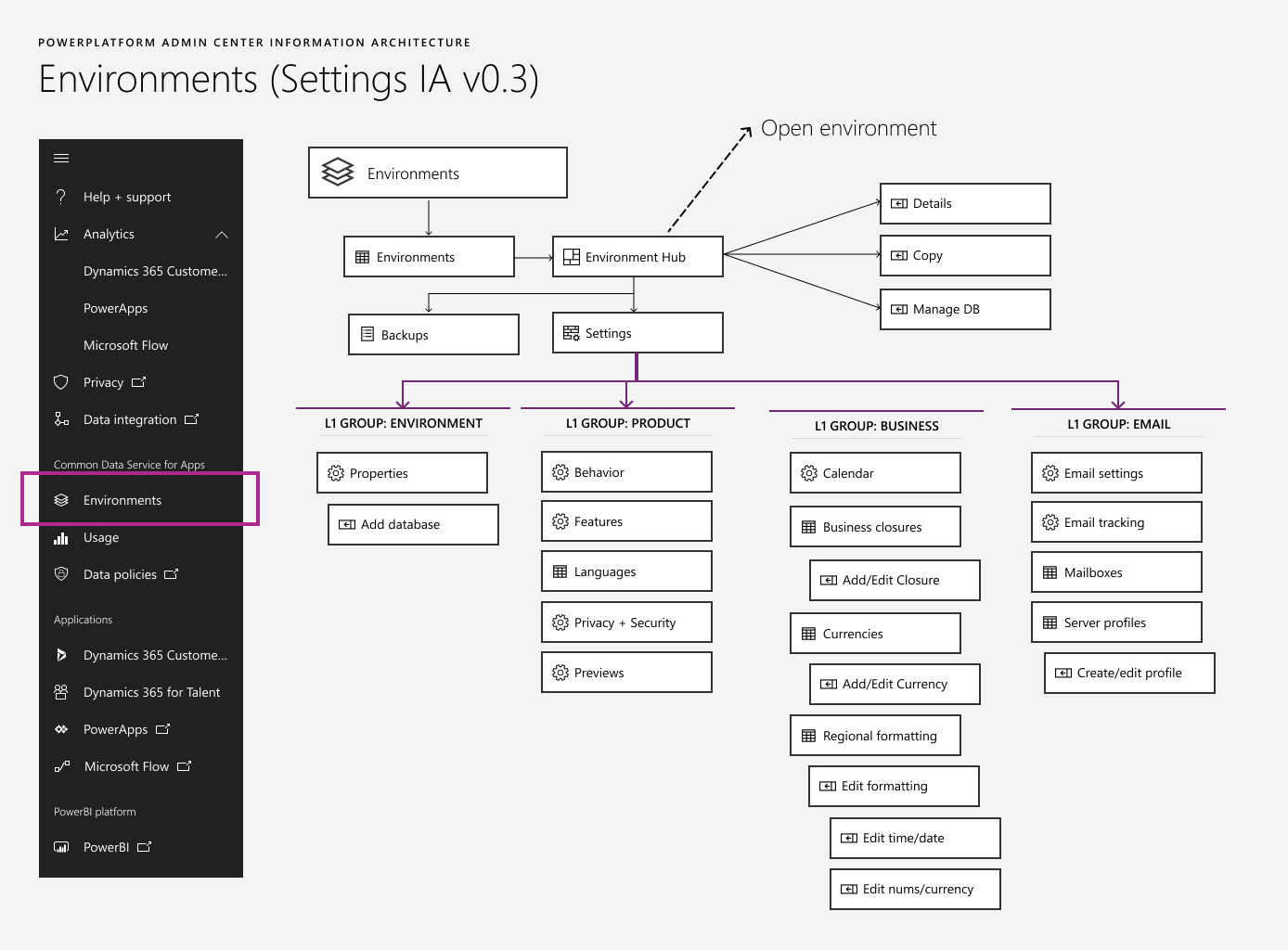
The “wall of links” is cheaper to implement and far less attractive, but it optimizes for the act of changing a setting as opposed to auditing the state of settings. L1 groups become semantic only, and are used to increase the accessibility of the page for screen readers or mobile usage. Links go straight to L2 pages, rather than L1 pages with links to L2. This also freed up the use of the pivot control for filtering large lists. However, the L1 groups don’t appear in the breadcrumb, which may cause disorientation or loss of context.


I took the output of phase 2 and rapidly pulled it into a presentation for our product management and development partners (and also to ensure the Design team was up to date.) My philosophy is that it’s important to bring our partners along on our journey, so I took specific care to document all of the inputs to the process and my reasoning behind the outputs and explorations.
Click here to review the original proposal (PDF)
We reviewed this presentation with our product management partners and came out with a clear path forward: the affectionately-titled Wall of Links.
Phase 4: Design individual settings pages
Once the path forward was set, my task was clear: implement designs of each specific Settings page that would be required for Public Preview, slated to start implementation in just a few weeks. As our broader design studio was making the move into Figma, this became my first large-scale design effort in Figma – learning a new tool alongside the large-scale design operation.
This work required quite a bit of cross-referencing with the Fabric UI guidelines and also page patterns like grids/lists developed specifically by and for sister teams within the Business Applications Group. The Figma file was handed directly to developers for implementation, with a different page used for each UI milestone (the June release was v0.2). Immediately after initial handoff, I began work on v0.3, which incorporated further feedback from stakeholders.
Example designs for the June release


Phase 5: Research and Iterate
While the implementation timeline was too aggressive to test our work prior to handoff, we still planned and launched a wayfinding study using the v0.3 handoff designs and Invision as a prototyping tool. My researcher took the lead (with my input) on launching an online study for 6 admin users without prior Dynamics experience. The study plan included 9 Settings tasks (2 for Behavior, 2 for Features, 2 for Privacy/Security, and one for Currencies.
Initial research findings
Success rates were solid, but there was considerable ambiguity related to the L2 pages “Behavior” and “Features”.
We decided to look for better semantic groupings, starting with an analysis of which settings were truly CDS-wide versus Dynamics-specific.
Customers also encountered a surprising level of confusion due to the “Office integrations” L2 page, which was proposed by a partner team.
Customers started there for all Office-related tasks. We resolved to provide alternate naming for that L2 page.
Moving forward with v0.4
Based on the results of that study, we decided to dig deeper for a new facet to differentiate features between Behavior and Features. We landed on a hypothesis that we might be able to distinguish environment-level settings (those not specific to Dynamics installations) versus Dynamics app settings (only valid if Dynamics is actually installed in an environment.)
While documentation was light, we found some subject matter experts that could help us make enough educated guesses to take another pass at the proposed groupings. This also allowed us the opportunity to address some excellent stakeholder feedback from an earlier review: there were environment settings elsewhere in the portal, and they raised a valid concern that customers would be confused by multiple Settings entry points.
Initial explorations for v0.4
This work has not yet been released. Images coming after the next major release.
Design impact
As of the time of this writing, v0.4 has been handed off to my successors, and work continues. The Settings v0.2 and v0.3 work went into private preview in July 2018, and public preview was announced in September. While only a few weeks have elapsed, the buzz in the community has already started – and we’re even hearing success stories where our new Settings design is leading to the discovery of previously-overlooked configuration options!
Why the Power platform Admin center is the future destination for managing Microsoft Dynamics 365 administration tasks. https://t.co/AG6Gp91Rch #MSDyn365CE #MSDyn365 #PowerPlatform #PowerApps #CRM pic.twitter.com/ixydoRALxz
— Preact CRM (@PreactCRM) October 2, 2018
Main navigation missing after Dynamics 365 Update! Old “Application Mode” was turned on… but how do you shut it off? New Power Platform Admin Center to the rescue! #MSDyn365 #powerplatform https://t.co/98LjkfcjMJ
— Nick Doelman (@readyxrm) September 26, 2018
 Public preview POR: The L0 “wall of links”, L1 groupings, and L2 links

