On November 1, 2017, I took on a new role at Microsoft as the Design Lead for a new and ambitious cross-product initiative, which 10 months later was released as the Power platform admin center. Read more about the site in Microsoft’s words at the official press release.
Problem Statement
Unify four different admin centers – Dynamics 365 instance administration, Dynamics 365 app administration, admin.powerapps.com, and admin.flow.com – into a single experience on a new UI framework. 10 months later, the site moved out of private preview and into public release.
The Team
MY ROLE: Principal Designer and Design Lead (from project start Nov 2017 – July 2018)
MY TEAM: 1 full-time designer, 1 vendor designer, 1 full-time content designer, 1 full-time researcher
KEY PARTNERS: Group Program Manager and 5 primary PM area owners (Environments, Support, CDS, Email, and Dynamics App administration)
Primary features we supported for initial release
- Core site design: information architecture, design system alignment, etc.
- Environment administration (formerly called instances) – creation, monitoring, and management
- Design updates to analytics content imported from other portals
- A new support “front door” for the entire Power platform, replacing previous Office.com front door
- A new home for hundreds of Dynamics 365 app settings
- Upgrade experience for moving business databases from legacy Common Data Service to newest version
Before: Multiple disparate administrative portals
Each used by similar personas, and in some cases a single scenario crossed 2-3 of these portals.


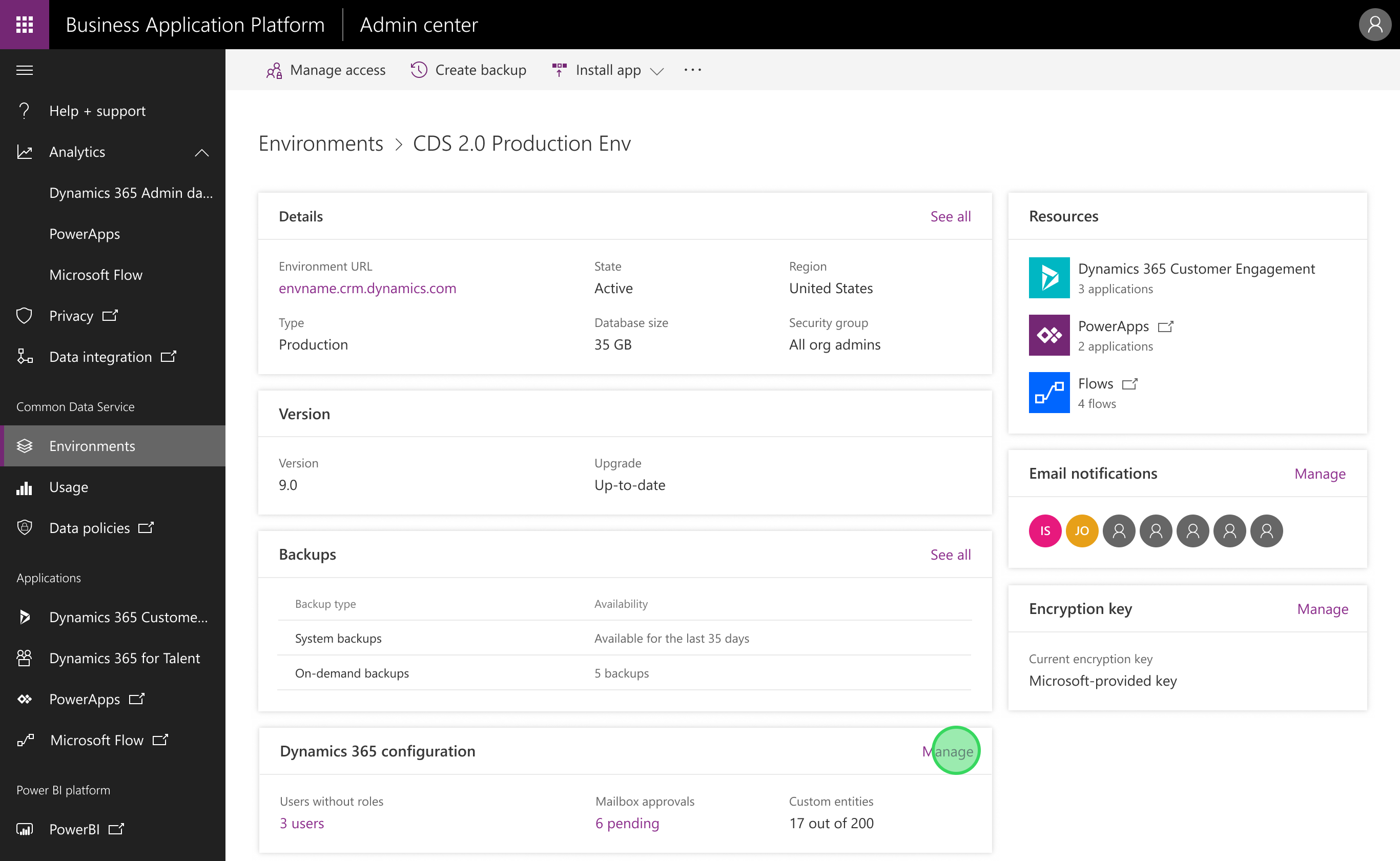
After: The Power platform admin center in action
Streamlined information architecture, consistent with the newest Microsoft control patterns, built with the customer in mind.

Future posts will go into detail about two design engagements I delivered personally: Dynamics 365 App Settings and the Common Data Service database upgrade scenario.
In addition, my team supported various Azure extensions including Logic Apps and Functions through an additional design vendor and split time from myself and our content designer.
Leadership Challenges
Stretching our resources
Due to prevailing conditions in our larger org, UX funding was limited. As design lead, I kept a constant eye on our team’s priorities and ongoing work, course-correcting as soon as reasonable when organizational priorities shifted. At the same time, we challenged prioritization changes that put core customer scenarios at risk.
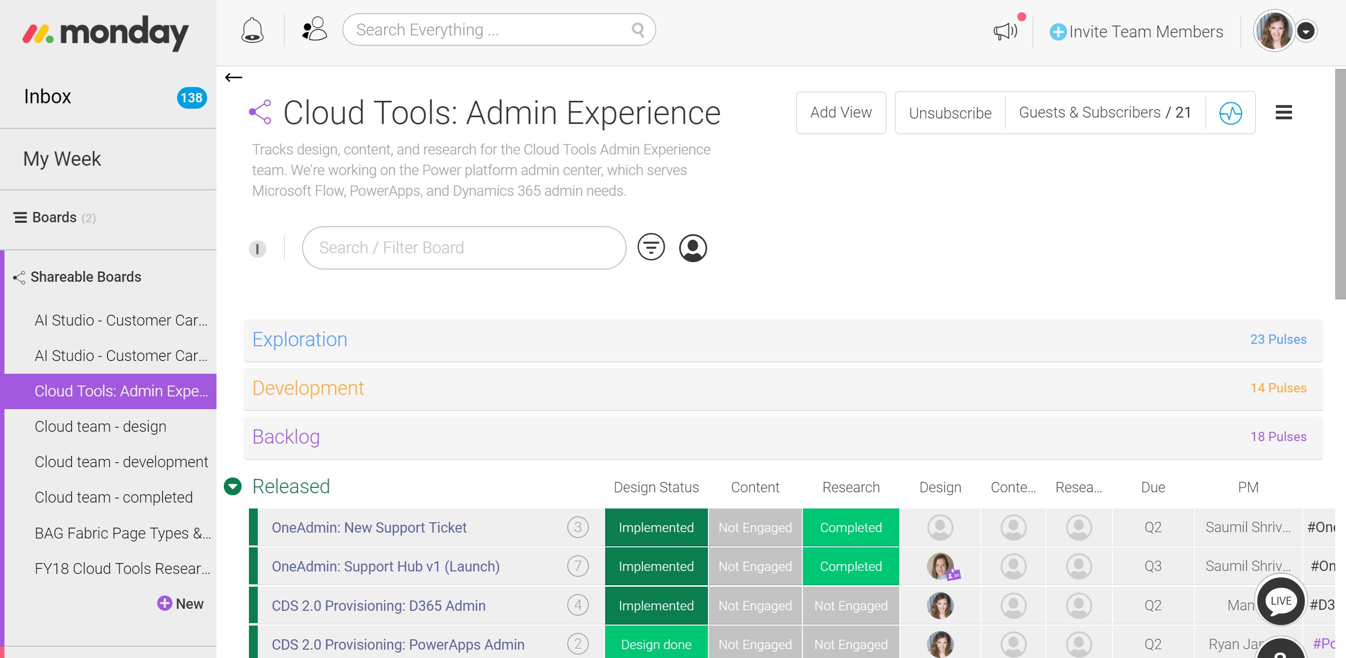
I championed the use of Monday.com as a team prioritization and communication tool, which greatly helped us during the challenging periods where priorities shifted aggressively. These tools also enabled us to work remotely more efficiently, helping us to weather team and family illnesses effectively and keep work/life balance relatively stable.
Information architecture
Information architecture for the site was a particularly contentious, long term engagement. Features surfaced repeatedly over the course of the engagement; new partner teams emerged and others were deprioritized. The platform itself shifted several times as well. And our attempt to unify four disparate portals meant significant streamlining of overlapping concepts, which involved socializing changes to very well established terms like “instances”.
As with many administrative products, customer time was hard to find, as only a few admin center users exist at each company. We crafted a conservative research plan that spent our limited pool hours on the most risky user experiences, in places where it was likely that prior experience would impact customers’ perception of new designs. Where we couldn’t afford to launch full studies, I supported my researcher in using alternative methods like cognitive walkthroughs with our peers.
We also partnered with a data analyst on our team to instead focus on frequency of use, exposing a limited risk to established memory since visits to the administrative sites were infrequent and rarely repetitive. This empowered us to make more significant changes in the name of simplicity.


Legacy technology and a fractured stack
The technology stack was a particular challenge for us. For the first 2 months of the project, it was unclear whether we’d be using the Office Fabric framework or the “Unified Client” framework built for Dynamics – or both! Halfway through my time on the project, we experienced a major shift in plans when the decision was made to move the Dynamics 365 app settings from Unified Client to Fabric/React. Unfortunately, Fabric wasn’t designed for the kind of deep information architecture present in the previous app settings experience. We had to quickly adapt the information architecture, explore undocumented features, and propose a plan that adapted to the hundreds of settings in a way that didn’t break the larger Fabric framework.
Cross-product impact
One significant part of our charter was to build out a new “support front door” for the apps on the Power platform, which prior to our release were using the Office support system. This cross-team cliff was causing significant increases in issue resolution times.
However, this cross-team charter certainly complicated communication and planning, as implementation and decision-making were split across stakeholders from multiple products. At several junctures, UX led the way in re-establishing lines of communication when teams had gone out of sync. My ability to empower my team members also lead to strong content leadership from my content designer when it became clear that our partner team hadn’t yet considered the source of our new deflection content.
Design for undocumented features
The migration of the Dynamics 365 app administration experience was particularly challenging, as we were faced with supporting literally hundreds of settings with no existing documentation. Our product management team originally proposed “porting” the pages wholesale, but many of them had never seen design or content intervention; and worse yet many were nested popups not supported by our newer UI frameworks (for good reason.)
I led the team’s charge to explore the existing functionality, cataloguing it, and applying standard design techniques like affinity diagramming and card sorting – as well as understanding of the available Office Fabric UI patterns – to develop a more manageable, accessible proposal for the migration of these legacy settings to the new site. This work is already paying dividends, as within days our customers are finding settings previously missed or neglected. (See Tweet reference below).


Learnings and post-mortem
Looking back, there were a few major opportunities we would have ideally spent greater up front time to solve: most specifically, the Outlook settings experience, which routinely took second place to other features, some of which were later postponed. Certainly, there was likely an opportunity to challenge the prioritization of design engagement to allow us some dedicated focus time on that particular engagement.
The other big learning was that if something seems inconsistent when a framework is implemented, question the specifics of the implementation early. We wrote some of the drift in UI implementation of the initial support front door off to “rushing” when in fact it indicated our partners in development had not consumed the division’s shared UI repository correctly. We could have engaged peers and experts to help head this problem off earlier.
Reception
General feedback will begin rolling in soon with the recent launch, but our rounds of initial testing were very constructive – solid customer satisfaction scores and success rates. We believe based on our early testing that we’ll see non-trivial NPS improvements. In addition, our support front door experience was measurably more effective even in its earliest incarnations.
Main navigation missing after Dynamics 365 Update! Old "Application Mode" was turned on… but how do you shut it off? New Power Platform Admin Center to the rescue! #MSDyn365 #powerplatform https://t.co/98LjkfcjMJ
— Nick Doelman (@readyxrm) September 26, 2018
Further reading
Stay tuned for some deep dives into my individual contributor work on this project.


