Brief — Customers — Phase 1: Discovery — Phase 2: Ideation — Phase 3: Design — Phase 4: Evaluation + Iteration
Project Brief
Despite its worldwide reputation as a philanthropic leader in several fields, the Gates Foundation still loses valuable information due to lack of governance, employee turnover, and tool limitations. Discovery efforts from my past work in productivity and collaboration, along with discovery from my colleagues in investment management, revealed the siloed state for knowledge management, with employees visiting a variety of different tools, often without knowing whether the information existed at all.

Our cross-functional partnership between the IT department and the Insights team within Global Delivery Programs sought to pilot a vision for a comprehensive knowledge management system: a single starting point that could lead to more timely access to more information, better equity for all employees, and unexpected connections and discoveries. There were several obstacles to success – team budget was limited due to the pilot nature of the project, we faced organizational turmoil at the foundation in the wake of COVID, and the foundation’s IT department had never before successfully spun up its own software product at this scale, having in the past worked with off the shelf solutions.
NOTE: This project was started with the stretch goal of perhaps sharing our solutions with the broader community long term. As such, the work is not inherently confidential, and has already been shared with members of the NGO knowledge management community. It is my hope that this process overview might also help those looking to perform work of this nature.
| Role | UX Design Lead Hybrid research/design, managing 2 UX designers over the course of the project |
| Project Length | 15 months (and continued after my departure) |
| Stakeholders | Director and Director-level stakeholders in IT and Global Health; Gates Foundation executives; key program staff members |
| Key partners | Deputy Director of Knowledge Management, IT Service Owner for Teams and Sharepoint, business systems analysts, internal software developers, external software development team, program manager, program officers, communications officer |
| Responsibilities | – All project planning for UX, and membership on KM Steering Committee – Partnership with leaders on strategic comms through Executive stakeholders – Workshop design and facilitation for internal team checkpoints and customer outreach – Competitive analysis of other industry KM products and standards – Synthesis of mixed method discovery efforts across dozens of participants – Ideation for KM project, from themes to use cases, success criteria, scenarios, storyboards, architecture – Hands-on design of entire pilot site, adapting to SharePoint design system – Creating and maintaining UX spec for the KM project – Partnership with internal and external developers on implementation and iteration of pilot site – Developing a long-term UX research evaluation plan – Hiring a Senior UX researcher/designer to own the ongoing evaluation program – Represent Gates Foundation to external KM community with presentation on our work |
| Impact | – Shepherded team leaders to a shared understanding of customer-focused project goals and success criteria – Successfully launched proof of concept on a Sharepoint-powered knowledge management system that provided a single point of entry to all key Gates Foundation information systems – Established a regular operational rhythm of design, delivery, and evaluation after pilot launch – Set the standard for technical product documentation with our UX specs on the project – Drove customer insights into our executive communications to help make the case for continued funding – Transformed insights from this discovery work into artifacts and evangelization that opened up entirely new partnership opportunities with the team behind our grant management system |
Customers
While anyone at the Gates Foundation might use this knowledge management system, we were primarily targeting those who do the majority of the work sourcing and reviewing grants – program officers and their deputy directors.
Our “hero partner” was the Insights team within the Global Delivery Programs division of the Gates Foundation. Where Global Health focuses on discovery of new health interventions, Global Delivery Programs focuses on innovative ways of getting critical health interventions to disadvantaged people who need them around the world. (For context, this project began in late Spring 2020 – just after the first wave of COVID-19, when the GDP team was deeply involved in both the distribution of PPE and the planning for future vaccine distribution.) The Insights team was formed with the goal of trying to better learn from the assembled data collected across all of their efforts.
Due to the long term nature of this project and our engagement with its stakeholders, plus our prolonged access to internal employees, our work on this project required me to coordinate longitudinal tracking of over 40 research participants – who sourced them, role and tenure, what types of sessions they participated in (across UX and BSA), when their last contact was, and when they would again be eligible for contact. Access to specific teams and roles was also gated by leadership approvals due to concerns about randomizing employees and ensuring a coherent message about the project.
Planning
This knowledge management project required an ambitious multi-year effort – a foundation-wide shift in technological philosophy. Past knowledge management efforts within IT had failed, putting an extra burden of proof on our project. Fortunately, UX and IT leadership had partnered closely before on projects, and improved knowledge management was one of the recommendations coming out of a major ethnographic study of work at the foundation. Both leadership and my UX team were aligned that this was not only going to be a technology challenge, but a behavioral one – technology would be useless without strong alignment with the existing work patterns present at the foundation.
This project did not occur in a vacuum – given my deep engagement on productivity and collaboration discovery efforts at the foundation, we were able to jumpstart this effort by re-analyzing discovery from several past projects, reducing the number of net new interviews we needed to conduct.
Roadmap
| Spring 2020 | Synthesis of past discovery |
| Early summer 2020 | Round 1 of new discovery – Insights team members Digital ethnography – Teams usage study, job shadows Working group charter and ideation |
| Late summer 2020 | Round 2 of new discovery – other GDP teams Synthesis across all collected data Ideation and strategic proposals |
| Fall 2020 | Designs for pilot site |
| Winter 2020-21 | Implementation and delivery of pilot site |
| Spring/summer 2021 | UX research on usability of pilot site Service design for knowledge intake Iterated design for future launches (every 6 weeks) Evaluations of iterated launches (every 12 weeks) |
| Fall 2021 | Prepare for operational usage Round 3 of discovery (international teams) |
Phase 1: Discovery
My human-centered design practice at the Gates Foundation relied on a strong basis of customer insight from employee feedback and observation. In tandem with my UX design team member Naomi, our first 2 rounds of research were specifically scoped to align with the most common use cases at the foundation. Round 1 of our new interviews focused on our direct stakeholders, who would be customers, and Round 2 focused on employees from the broader pool of Global Delivery Programs. For contrasting viewpoints from the rest of the foundation, I re-analyzed recent discovery conducted for the US Programs team, and scattered discovery with other individuals across the foundation that met our desired initial profile.
There were some unique behavioral insights that stood out in addition to the key findings below. Specifically, it seems that foundation employees were driven by a desire to ANSWER questions aligned with their expertise – hence the high engagement with questions in tools like Teams. This is interesting since it is not inherently in the job requirements, but it was so important to employees it meant that the later prioritized use cases saw “respond to open questions that align with my expertise” at the top of the list. Further, it was clear that people had stopped sharing their content in many cases because they’d convinced themselves no one would use it – so any successful solution would likely need a virtuous cycle of feedback to reward people for putting knowledge into the system.
| Target customers | Stakeholder customers: GDP Insights team Additional customers: GDP employees with specific role profiles we hadn’t yet hit Other foundation employees: USP via research review; other teams via research review | |
| Techniques | Interviews Job shadow / contextual inquiry (digital due to COVID) Observational contextual inquirty (digital in Teams) Research review | |
| Key Findings | Usage of Microsoft Teams helped teams communicate but REINFORCED cross-org silos. The shared file system didn’t adequately support different mental models for how information should be shared. People wanted to find answers to questions, but the tools only supported finding whole documents People relied on personal filing systems in order to find information faster, leading to the use of stale and outdated documents People regularly acted as conduits for information and answers Questions were a key driver of digital conversation and contribution. |
In addition, there were some particularly evocative stories that emerged from this discovery. One chief of staff shared how digital copies of multi-million dollar reports were lost, and she only had them in paper form somewhere in her office. With the type of work that the foundation does, data loss could literally mean life or death for people down the line, or at minimum the waste of money and resources that could be going to much more meaningful ends.
Phase 2: Ideation
As the scope and shape of the most pressing problems and opportunities became evident, UX moved into our ideation phase in order to define the shape of the upcoming pilot project. Ideation had three main steps:
| Step 1. Identification of Themes | For step 1, I designed and facilitated digital workshops using MURAL to collect a variety of team member perspectives and drive us towards a shared understanding. These workshops were conducted with all key team stakeholders. | |
| Step 2. Identification of needs and success criteria | This was a collaborative exercise between UX and our Business Systems Analyst from the Programs side based on review of our findings share-outs from discovery. We assembled a shared list of use cases, translated them into success criteria, and then sent these out to customers in Programs as a survey for prioritization. | |
| Step 3. Proposed solutions reflected in storyboards and key scenarios | My design team member and I spent several days in a huge MURAL board brainstorming, mind-mapping, and drilling down to the scenarios of highest priority based on all data points that had come in. As a part of this work, we also generated supporting deliverables to aid in shared understanding of the processes and people. |
Project Themes
The team agreed upon 3 major prioritized themes, inspired by findings and open questions. These were intended as our “north star” vision, to aid in decision-making and prioritization when new ideas or budget changes came up over the course of the project. We also made the conscious decision, based on the data, to focus on the beginning of the grantmaking process – during the COVID crisis this was demonstrated to be a particular opportunity and pain point.


Connecting people and their work
While our findings did indicate that people were acting as the foundation’s information search engines, we also heard that employees valued their personal connections and conversations. The pain point was not the conversations – it was figuring out who to talk to. Since that information relied so heavily on personal networks, it created an equity issue where people with marginalized identities were hit hardest, largely unintentionally. The need identified was a system that made it easy for anyone to identify an internal subject matter expert on an arbitrary topic without human intervention, and a system that allowed people to prepare for those conversations to make the most of that 1:1 time by making it easy to access a specific individual’s work.
All data, one place
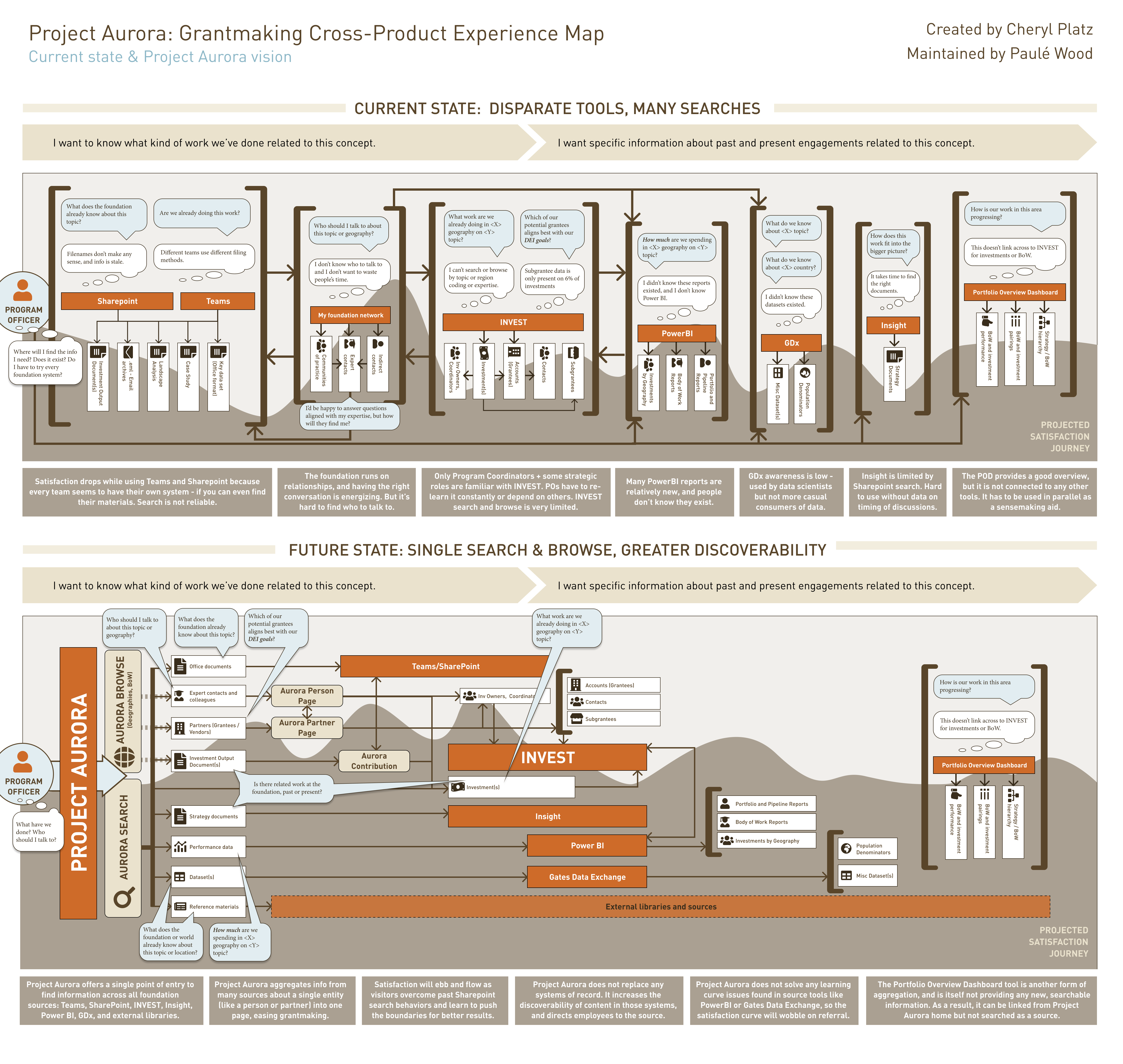
A strong, clear theme across all of our IT discovery work was the time lost working with multiple tools to try and find a piece of information. If you weren’t sure where an insight might lie, you might be forced to check 2-5 systems, each one potentially with its own login and search infrastructure, only to find nothing on the other end. This led to several issues: a lack of discovery leading to hundreds of thousands of dollars in duplicated work, and a delay in discovery making it extremely painful to react to global events like COVID. A faster, more comprehensive solution was necessary.
Right info, right time
This was the most ambitious of the themes, and focused on separating the wheat from the chaff. The Gates Foundation has reams and reams of information, but program officers don’t need all of that all the time. How could a central system answer specific common questions quickly, and leave the detailed questions for the specialized tools where the data lives?
New knowledge types
Based on the theme “all data, one place”, our proposed technical architecture (I actually penned the first tech architecture diagrams) involved a system that, as much as possible, searched data that was stored in other systems rather than trying to migrate data from these disparate systems. There’s no reasonable way one system could become great at everything, but what we could do is provide visibility across things like investment management and data analysis tools.
However, as illustrated in the earlier printout story, there were clearly knowledge artifacts that were not included in the knowledge management systems of record. Iur UX team proposed a semantic model for the new overarching types of information that could and should be included in the long-term vision for this knowledge management system.
- Key Artifacts: Outputs from transactions and other non-transactional documents, like datasets
- Partner Notes: Observations about working with a particular partner in the (intentional) absence of a full CRM solution
- Lessons Learned: Process-oriented and cross-project insights that don’t map cleanly to a specific investment record

Ranked priority use cases
- Discover new content and respond to open questions that align with my expertise
- Browse published content by contributor, partner, region, meeting/event, topic, investment, type
- Get feedback when my content is being used/appreciated
- Use a standard folder structure for my team
- Search for relevant people, documents, or knowledge from a single location
- Get answers to my open questions seeking information or insight
- Publish my completed work and grantee docs for internal reference

Proposed Solution
Our long-term proposal was a two-pronged solution:
- A traditional knowledge base front end built on an existing foundation toolset (Sharepoint) to avoid complication of additional tools
- A conversational agent to bring search and insight capabilities to people in the app where they spent most of their time post-pandemic: Teams.


Both of these required a cross-tool backend that wrangled all of our disparate data sources into a single stream of query ready information – along with an independent solution for storage of the net-new content not currently supported by existing processes, and strong metadata to expose tags, topics, and key questions and answers.

Phase 3: Design
In the initial design phase, the project temporarily ran short of funding for design and I worked as a solo practitioner until the beginning of the calendar year allowed me to recruit for a replacement designer. During this stage, I worked on an aggressive schedule to translate all of our concepts into a complete first draft design for leadership review, all aligned with existing Microsoft Sharepoint design system standards.
This phase was a growth opportunity for many partners on the team, as few had worked on a software project before. I relied on my past experience to lead by example with strong documentation and delivery – my UX specs became the primary source of truth about the project for over 6 months before the team evolved to begin a technical spec document. As with many of my projects, I also noted that there were many gaps in understanding that UX could heal, and to that end we generated experience blueprints and journey maps for key scenarios like publishing to help all partners think about the end-to-end experience.


A particular design challenge was integration with Microsoft Viva, nee Cortex – an artificial intelligence system for Office 365 that can create aggregated topic pages from content. It was unclear until 8 weeks prior to pilot whether we would receive pre-release licenses for the technology, and designs had to be adapted in real time. Due to the limited team size and the complexity introduced by this new feature, chatbot features were shelved indefinitely to focus on core functionality.
Key Features

Universal Search
“Project Aurora” was the first time we successfully connected multiple foundation systems securely to a single search engine. Under the Sharepoint framework, we built out a single search engine that could return people, partners, investments, AND documents related to a specific search. But beyond that, we also spent considerable time working on the taxonomy and how we might represent major concepts versus automatically discovered concepts via AI.

People Pages
Based on our first theme, Connect People to their Work, People pages for the first time at the foundation treated employees as a primary subject of interest. These pages collated aggregate data from Microsoft Office, Workday, and our investment systems to provide a snapshot of an individual’s expertise and engagement over time. Not only did we surface the person’s current team, tenure, and project, but we made it easy to see their entire investment history, their frequent partner entities, AND a list of their most frequent internal employee collaborators. None of our existing tools provided this cross-section of information in one place.

Partner Pages
A large amount of program officer work revolves around the vetting of potential partner entities, and our Salesforce investment management solution made it hard to get a sense of everyone who’s worked with a grantee on something. Partner Pages solve this problem by bringing all of a partner’s investments into a single, filterable list, along with a quick view of the internal employees who have worked with that partner and any documents that are related to that partner.
Browse Experience
Discovery data indicated approximately a 50/50 split between browse and search scenarios. While search is useful when you know what you’re looking for, program officers looking to make a new investment are more likely to be looking to browse in large conceptual categories, like a region or a topic. Designs for Project Aurora included browse pages for regions, topics, and tags to enable this start of investment process scenario.
Phase 4 – Evaluation and Iteration
It’s never enough to just launch a pilot – we must constantly learn and improve. The pilot was exciting from a technology perspective, but it was sandboxed to a specific set of documents in pre-identified topics, and it didn’t lead to daily use. Our Business Systems Analysts were used to doing direct face-to-face Q&A for feedback, which led to some leading questions and missed opportunities. I built out a proposed evaluation program, hired a talented full stack designer Paule to take on the daily operation of the evaluation and iteration program, and we began with a UX baseline of the pilot project. Afterwards, we adopted a cadence where we alternated every 6 weeks between lightweight spot check usability studies and large scale end-to-end usability studies, synced with the broader team’s sprint and delivery cycles. UX partnered with the BSA team, who continued running “happy hour” face-to-face focus group sessions after key releases, to synthesize our findings.
During the evaluation phase, I shifted back to a leadership role, establishing our planned cadence and activities and coaching our new hire Paule – who had experience with qualitative research but not running usability studies – to begin running this program. I shared examples from my past work on the Teams project and Visitor Management project for tools like the Single Ease Question and methods for reporting task success in a granular way. We also worked closely on the final themes for each quarter, ensuring that what was presented reflected the findings in a way that did not cast blame or threaten partnerships when difficult feedback came in, and in a way that also made clear what priorities should be top of mind.


Key Feedback
Reactions were positive in general, especially on the promise and utility of the site:
“I thought it was going to take me to their [investment management] account and I wasn’t going to click on it because I don’t always find what I need [there]. So I’m happily surprised that I’m wrong. This is cool.”
“That’s helpful in responding to outside requests. Like, are you funding work in this region or this country? And you can say: why yes we are, we’re funding… and I can look it up and it’s quick.”
However, there were plenty of specific opportunities – and some things we only got via observation. By far, the most surprising observation was behavior around filters. We’d placed filters in an industry-standard left-hand column format. However, in usability testing, our participants were missing the filters consistently. Participants also proved to be exceptionally eagle-eyed, and any irregularities in response counts (which could occur due to the developmental nature of some of the AI tools we were using).
“What I am thrown by is that on the previous page under investments, there were 31 investments, and under the [people] list there’s 108. And I’m like, oh, how do these 2 match up? There’s 108 working on it? Or only 31 investment owners?”
Key changes as a result of the evaluation program
Filter location
After several attempts to address the low filter usage with styling, text, and information hierarchy changes, I proposed we make the radical change to flip the filters to the right side of the screen. Shockingly, this addressed the concerns and led to much better uptake, even though it runs counter to patterns on widely used sites like Amazon. This change required socialization within the team, as there was some resistance to break well-established patterns.
New geography focus
Our evaluation sessions shone light on the importance of geographical engagement in looking at people and partners. Our initial discovery indicated a roughly half-and-half split between searchers and browsers. When you know what you’re looking for, you search. When you need to answer questions, you might browse. In particular, a program officer looking to invest in interventions in a specific region is going to want to see partners working in that region. We spent extra time expanding the People and Partner pages to report regional engagements, and iterated our Geography browse pages multiple times to dial in the experience based on technology constraints.
Expanded subject matter expertise
Our initial cuts at the data focused too much on the investment owner, and evaluation sessions exposed that valuable signals that indicate subject matter expertise came from other places: investment coordinators, and less obviously investment REVIEWERS. We spent time with our data team to re-engineer the People search and collaborator sections on the People pages to reflect this nuance in the results.
Strategy and Future Impact
In Fall of 2021, we moved into pitch and expansion mode – we developed a formal executive presentation to share our progress and pitch full funding for the project. At the same time, we began Round 3 of discovery, interviewing operations managers across the globe and starting direct engagement with our India program office to learn of their specific KM needs in order to stress test these designs against a much different set of requirements. During 2022 operations planning, Knowledge Management generated significant energy and excitement across the foundation, with multiple teams asking to be read in or to get an update on our timeline. As much as possible, we engaged with interested teams to make sure we were a coalition of interested parties and not creating a situation where any team would spin off their own solution.


I departed the foundation in November 2021. At that time, the KM team had just successfully made their case for funding for 2022 – 2023 to move from the pilot and beta to full foundation-wide production, informed strongly by employee perspectives and insights from our UX work. At last check, the project was continuing along the original plan towards the same goals, and I remain optimistic that the foundation will see considerable value from our work at the end of this journey, reducing duplicated work and leading to new and unexpected connections between experts in the hope of better, faster solutions to some of the world’s biggest problems..
Brief — Customers — Phase 1: Discovery — Phase 2: Ideation — Phase 3: Design — Phase 4: Evaluation + Iteration


