Many of our in-vehicle apps needed to provide information to the driver, and expected the same interruption models they enjoy on mobile phones. However, in an automotive environment, interruptions threaten the driver’s safety. Our solutions had to work in a multimodal environment, with potential touch, voice or hardware input. We designed, tested and implemented a notifications system that optimized for drive-related, time-sensitive notifications where a simple binary action can be taken in the vehicle.
Logistics
Work on the Windows Automotive design team was broken into 2-week Agile sprints: each sprint was either Design/Exploration, Prototyping, Research, or Final Design Delivery. Phases would be repeated as necessary until a proposed set of designs in prototype form passed NHTSA driving safety guidelines in research via our simulator, at which time we moved forward to design specs for development. Once implemented in the OS, designs would once again be validated via eye-tracking tests, but this time in-vehicle during test track studies.
Team breakdown
| Design team | Project Stakeholders |
| Myself – Design Owner 1 Program Manager 1 Prototyper 2 UX Researchers | Feature area program managers for each hub area: Media, Climate/Controls, Communications, Navigation. Speech feature program manager Hardware and software development team Design Studio head and Automotive team leadership |
Exploration and problem definition
Prior to beginning any design work, I had to identify the scope of the design space – which was vast. There was no centralized list of the notifications that would be needed for this particular version of the OS, as numerous features had been added since the prior release. I began by scheduling 90-minute deep dives with the program managers in charge of each OS hub: Media, Climate/Controls, Navigation, and Communications. During these sessions we walked through the existing automaker, government, and feature requirements for those spaces and mined them for any potential notifications. I was careful to set expectations that many notifications might fall “below the fold”.
The output of these sessions was a master list of notifications I could mine to create a taxonomy. The taxonomy required a few iterations, and then a round of socialization across all of the stakeholders. The notifications taxonomy identified what sorts of information can be shown as an interruption, and what information could wait until after the drive.
While our initial proposal included more categories, our final notifications taxonomy allowed for 3 categories: Critical notifications, Actionable notifications, and App notifications primarily used as immediate feedback to confirm a direct customer action. (Items that did not fall into one of these categories were punted until after the drive, a separate design pattern I created that led to the issue of US Patent 9944182B2, Post-Drive Summary with Tutorial.)
Design Explorations
Initial Visual Designs
In my initial work, I experimented broadly with size, placement, appearance and content of notifications. Options were narrowed via peer critique and prototyping/simulator testing. Note that in general, animation is prohibited while in motion for most in-vehicle UI due to concerns about distraction and performance.
- Placement
- Along the top near the roadway?
- Close to the driver on the left side, for ease of reach?
- Or farther away at the bottom of the screen where it’s less likely to distract?
- Size
- How much of the screen should be reserved for each message type?
- How much content is too much? What government restrictions are in place?
- Aesthetics
- How do we balance visual prominence with distraction from the roadway?
- Should the rest of the UI be visible, lightboxed, or obscured entirely?
- Do any options cause disorientation, or too much visual distraction?
- Interactions
- Where should interactive elements be placed?
- How large should touch targets be? Are they reachable by the driver?
- How do we minimize accidental button presses due to road conditions?
I also developed a series of rules for the implementation of the notifications to prevent accidental dismissal or overload. For example, interactive notifications must wait for at least half a second before taking touch input to prevent accidental dismissal.


Voice & Audio Design
Actionable notifications and Critical notifications also required an element of voice design, as they were displayed with an associated voice prompt that allowed drivers to take action without looking away from the road. In these cases, the prompts did not always mirror the language onscreen, as acoustic conditions in the car make certain shorter words very difficult to recognize accurately. Instead, the voice prompts directed drivers towards words most likely to be recognized successfully on the first try.
All notifications came with an audio component as drivers were unlikely to be looking at the screen at the time of arrival. These earcons were sourced from existing Microsoft/Cortana audio libraries.
Prototyping and Usability Research
The Windows Automotive project required a high level of research rigor due to the high risk of deploying a user interface in a moving motor vehicle. I worked closely with our prototyping team to see the designs implemented in Flash and moved to our simulator for testing – a custom rig consisting of Ford Explorer steering controls and seats combined with custom-built dashboards with inbuilt tablets to which we could project our UI. The steering controls directed a commercial driving simulator on a 3-screen immersive setup, and all drivers wore eye tracking glasses so we could monitor glances away from the road. UX research was run by our 2 researchers and I worked in close collaboration with them to develop the testing protocol and review the results.
Research Questions
- What visual patterns are most effective when presenting notifications?
- What notifications are relevant to drivers while in motion?
- What actions can be taken? Are these notifications safe and useful while in motion?
- What happens when a notification is missed?
Key Insights & Iterations
I iterated on my designs based on several simulator-based studies while driving. Our findings enabled us to limit the types of information shown while in motion, and verified that the binary action model was successful. Final designs were verified as safe against NHTSA standards using an eye tracker in controlled track testing in SUVs.

Content types
We learned during testing that drivers were very specific about what messaging was appropriate when driving. If the driver couldn’t take action during the drive, the information was deemed a distraction (for example, tire pressure is low.) Drivers preferred to get this information before or after a drive unless it was a severe issue. Thus, a fourth “informational” category of notifications was eliminated as a result of these tests.
Binary action vs multiple choice
Rather than present all possible actions (answer, decline, respond with text, send to voicemail…) we focused on a PRIMARY ACTION and a NON-ACTION (ie, decline). For cases where the vehicle was stopped, more actions could be presented.
Driver interaction preferences for voice
When touch and voice interactions were presented, drivers indicated a strong preference for voice interactions every time. While we did not make plans to eliminate visual interactions due to the many circumstances that can make voice interaction impractical (especially in a noisy motor vehicle), this did indicate the relative success of the voice interactions to achieve their goals of allowing drivers to complete tasks while staying focused on the drive. These findings were particularly notable for the time – in 2013, natural language user interfaces were NOT common and most vehicles still didn’t include voice interaction as standard. The viability and desirability of the interaction were not assumed, and this preference was an important finding that helped justify future prioritization of voice interaction features on the platform.
Successful intervention in high risk moments
The Critical pattern was a big open question – would we be invoking panic? Would customers be disoriented by the full screen notification? What would customers do in response? We were pleasantly surprised to find that the full screen Critical notifications had exactly the desired impact. When they appeared, customers calmly took in the information and began making plans to stop or modify operations of the vehicle per instructions when it was safe to do so.
The only change we made in Critical scenarios was to reduce available options to a single choice plus the Dismiss option, as seen in Actionable notifications. Dismissal was potentially desirable if identifying a nearby service center or offramp, for example. In both Actionable and Critical scenarios, 2 choices was 1 too many.
Final Designs
| Type | Visual | SFX | Voice | Actionable? | Interrupting? |
| App | Toast | Yes | Nav only | No | No |
| Actionable | Partial Overlay | Yes | Yes, or ringer | 1 action | Yes |
| Critical | Full Overlay | Yes | Yes | 1 action | Yes |
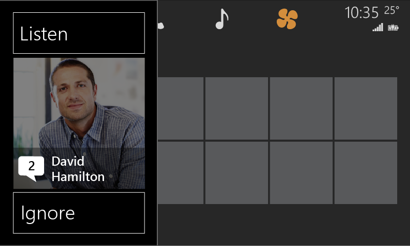
Actionable notifications are lightboxed to avoid creating a disorienting loss of context. A binary choice is presented with minimal supporting text. The controls are oriented to the driver’s side and physically separated to avoid accidental selections due to vibration of the vehicle during touch selection. These screens were accompanied by a full voice UI including sound, spoken announcement, and question prompt.


Critical notifications indicate immediate threat to the safe operation of the vehicle. In test environments, participants responded as desired, calmly pulling the vehicle over as soon as it was safe.

App notifications (“toast”) were used for confirmations on background tasks (like “FM 89.5”) and selected alerts not related to the drive. Many drivers chose to ignore these entirely.

Impact
While the Windows Automotive project was sunsetted before these designs made it fully to market, they did make it into the full OS build and were validated via test track testing. We ran participants through the same scenarios in Ford Explorers at a local commercial race track set up with obstacle cones to force attention to the road, and all participants wore eye trackers so we could verify continued compliance with NHTSA standards. No new concerns were identified during this round of testing.


