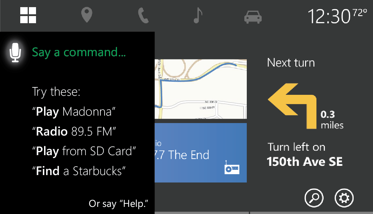
Design a new voice user interface (VUI) for use in the car that passes all automotive industry distracted driving safety standards. In addition, guide all 5 major feature teams on the appropriate use of speech within their areas (Start, Navigation, Media, Communications, and Car)
CONTRIBUTORS: Myself (design owner) / 2 Program Managers / 2 Researchers
Process
Our early process focused on developing a push-to-talk experience that provided guidance to users without overwhelming. Careful attention was paid to multimodality, error handling, and the interaction between the VUI and GUI. I drove hands-on deep dives (in partnership with the lead Speech program manager Stefanie Tomko) with every major feature team to explore their feature spaces, prioritize use cases, and build out end-to-end scenarios.
Mid-project, the Cortana initiative was announced, and we quickly pivoted to adapt for natural language input when appropriate. We also generated a series of storyboards, designs and cinematics for an all-audio experience using this technology.
The project was halted due to shifting corporate priorities, but prior to that point our voice designs and accompanying visual designs had undergone multiple rounds of rigorous user testing, from Wizard-of-Oz tests to test track evaluations.
Design Samples
Navigation Flow

Error Handling

Multimodal Design

Visual Design Explorations
A sample of push-to-talk screen designs, which were heavily tested to determine which layout resulted in the least driver distraction based on length of eye glances away from road and task success. We intentionally minimized animated elements to comply with best practices for driver distraction.


