My time on System Center Configuration Manager 2012 spanned four years of design and hundreds of UI surfaces. Perhaps our most important task was redefining the information architecture of the product – and to do so, we had to drive years of detailed user research and iterative design experimentation.
Problem Statement
SCCM 2007 was largely produced without UX consultation until the endgame. As a result, the product’s IA was a single, massive tree that represented every object type – and every individual object – in one long branched list. For large companies, expanding the wrong node could grind the whole experience to a halt.
Three people contributed to this effort: I drove the design side with frequent collaboration from my peer designer on the product. The research side was headed by our product’s dedicated UX researcher.
Case Study
Phase 1: Analyze

As inputs, we took the previous tree structure from the 2007 version and a later usability report about the issues. We also took into account information architecture decisions occurring on other System Center products. A great deal of time also went into discussions with product managers with direct customer contact.
We found our greatest opportunity would be to identify new top-level groupings and find objects who depended upon a parent object for context – we could remove those from the overall tree and flatten the experience. At the same time, a major directive was to prevent regressions for experts, who managed information systems for the world’s largest corporations.
Phase 2: Flatten the Tree
One of the most obvious problems was the impracticality of listing all objects in one tree when there might be thousands in each node.
To get to this IA, we demoted several “child” objects and removed them from the main tree – but to do so, we had to introduce a new visual design affordance for the preview pane, enabling children to be viewed in the context of their parent objects.
Phase 3: Prototype Version 1
After our first round of IA work, we decided to prototype a new interface using the new architecture and put it into iterative lab testing.
Among our major findings was validation of our decision to demote certain object types – admins did not have any trouble getting their heads around the concept, and were even delighted by some of the proposed changes to the preview pane.
Phase 4: Iterate
We took our findings from the first round of testing and spent several months evangelizing the changes with PMs and taking feedback. We reported our findings and our design/ test plan for the future. Our top level groupings remained consistent, but some child nodes were moved based on feedback.
At the same time, we were forced to incorporate major changes to the product roadmap, called the “Client of the Future” initiative – incorporating more user-centric management principles. This was a major paradigm shift for the product.
Phase 5: Card Sorts
One of the challenges of working on Configuration Manager is the small number of users  available for testing. Our earlier tests burned through most of our available local pool. But with the sheer scope of tasks available, we needed more quantitative research to validate this important work.
We slowly built up the user list required to do extensive quantitative research. We also took advantage of the annual Microsoft Management Summit to do in-person open card sorting exercises with admins from outside of the Puget Sound.
I worked hand in hand with our researcher and PMs to tune the tasks presented and to help interpret the results, suggesting changes based on the findings.
Phase 6: Iterate (Once More, With Feeling)
As we incorporated the card sort findings, yet more feature changes came down the pipe, as well as a looming Beta 1 deadline. Within a relatively short time period we made several major iterations to the IA, initiated more testing, and evangelized again with our PM counterparts.
Phase 7: Finalize
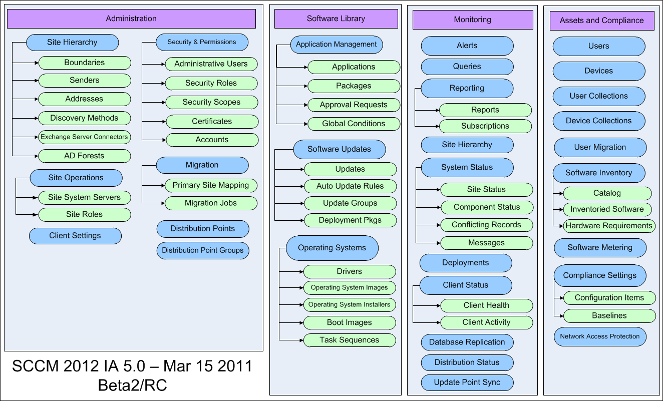
In the end, we settled on just 4 major groupings based on a large body of research, analysis, testing, and design work, including some new information on user roles.
Beyond the top-level grouping changes, we found homes for a number of problematic child nodes and new features. Meanwhile, we introduced changes to the framework that allowed us to flatten the tree significantly from previous versions of the product.
TOP LEVEL GROUPINGS:
- Administration
- Software Library
- Monitoring Assets
- Compliance
These groupings managed to minimize role splits across workspaces, were validated via multiple rounds of user testing with multiple personas, and maintained reasonable consistency with other related System Center products. They shipped in SCCM 2012 and received positive reactions from our customers.


