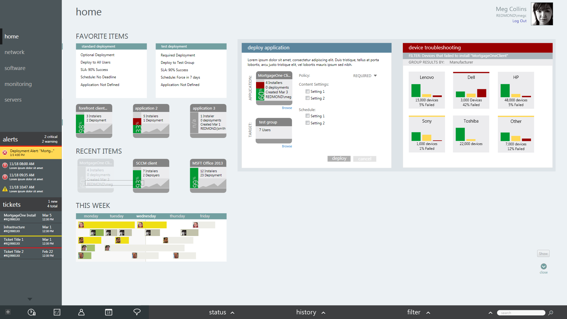
In 2010, we set out to explore a unified approach to the most complex IT processes – software deployment and incident management in large networks. From initial scenarios and paper sketches to high-fidelity prototypes, videos, and user testing, we used this “concept car” as a vehicle for exploring the impact of large screens, multiple product integrations and new approaches to object manipulation in a server environment.
Our work was very well-received by our stakeholders and served as the inspiration for a number of concepts that made it into future design patterns and products, all the way through Azure’s initial release.
Design Inputs
We began the process with a few early concepts from another designer on the team. Together, we worked to build the scenarios around which we’d rally for a far deeper, end-to-end series of explorations.
Behind our work on these designs was an underlying hypothesis that our users only focus on a few tasks at once, that evolve over time. Rather than exposing long lists, expose frequent and recent objects and use the extra space for visualization and manipulation.
Design Samples
Sketches
Many of these sketches focus on a new concept, the application tile – it contains all of the information about a particular app’s deployment, but can also be physically manipulated on the canvas. Heavy use of progressive disclosure to handle complicated objects. Also included below are a few explorations for a tool allowing administrators to drill down on properties of troublesome devices, looking for patterns and commonalities.
Storyboards
I then spearheaded translating these sketches into end-to-end storyboards. We eliminated extraneous concepts and found a compelling story and a testable set of scenarios.
High Fidelity Comps
The last step prior to our handoff to our prototyping partner was moving these ideas into high fidelity – in partnership with the other designer on the effort.
Findings
From the storyboarding phase, we moved on to high-fidelity prototyping to enable interactive testing. Though resources were limited, we managed to test our prototype with some of our target users (IT pros). Feedback was positive and constructive from this user base notorious for being resistant to “easier” software.
Verbatims:
“This is incredible compared to now. It is easy to make changes. Very well thought-out.”
“The pre work – patch work – post work and view status on the screen would be huge!”
“I actually like it. What I like is I don’t have to dig through the console to find what I’m doing.”


