In the fall of 2016, my responsibilities as the Azure Framework Design Lead expanded to include direct responsibility for our pro developer marketplaces. When we began, the only active marketplace in our purview was AppSource.com, but there was an immediate need to take the lessons learned on AppSource and apply them to a completely new approach to the existing Azure Marketplace.
Role and Team
For the 2.0 version of the Azure Marketplace, I was the sole designer, working with 3-4 program manager partners and several UI developers on a daily basis. In addition, I partnered with our team’s content designer to review all text and terminology along the way. The engagement began at the end of October 2016, and all generative design work had to be completed by the end of the calendar year. The site went live at the end of January, 2017.
Problem Statement
- Apply and modify the design patterns established on AppSource to a brand new version of the Azure Marketplace.
- Generative design on an aggressive timeline for Azure Marketplace specific features: most importantly, login flows and virtual machine pricing.
- Ensure design does not conflict with existing Azure.com styling and patterns
- Adapt existing designs and new designs to use the proprietary Microsoft Web Framework (MWF).
Feature: Virtual machine product pages
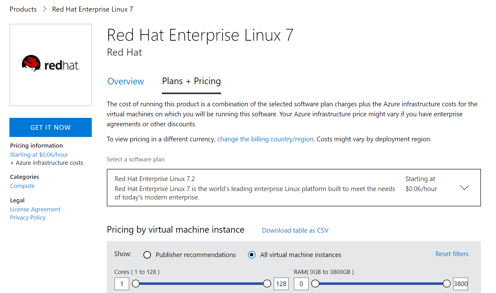
One of the most challenging new features needed for this Azure Marketplace implementation was support for the complexity of virtual machine pricing. Pricing for virtual machine offerings varies wildly based on a number of factors: billing country, software plan, number of CPUs supported, amount of RAM and disk size, etc. As this design engagement was alongside 4 other new engagements for the site launch, we had only 3 weeks from beginning to end of the design phase.
Design pivots
For complex design problems like this one, I start by identifying design pivots: individual design variables that can be changed relatively independently. We can mix and match various approaches to design pivots to reach our final design.
In this case, the virtual machine pricing feature pivots included:
- Relationship between billing country and software plan
- Control used to expose software plan
- Placement and visual treatment of filters
- Grouping and selection of filters
- Method of highlighting “publisher recommended” configurations
Round 1 Explorations
This initial round of explorations went very broad; a selection is shown below. I was working to get coverage on multiple options for each of the design pivots identified above.


Feedback on this initial round of explorations led us to close in on a single-tab experience, favoring a rich dropdown for the software plan selection rather than a modal dialog. This decision was partly motivated by the content available: the long descriptions of existing software plans offered little additional utility, so why force customers to a separate page to view redundant content?
Round 2 Explorations
The number of filters required (and the number of columns for the search results) expanded during Round 1, so we gravitated towards horizontal filter layouts. With our first 2 design pivots in consensus, these designs focus on the latter 3 design pivots.


As I explored these options, it forced further discussions about the scale of publisher recommendations. We eventually realized that customers would almost never need to BOTH filter the results based on recommendation AND size. This, combined with other feedback, led us towards the strong visual grouping of the filter options, combined with the toggle between VM size and recommendation filter modes.
Final phase of design
Once we had resolved the answers to the design pivots identified above, we began an intensive round of content reviews and further refined the fit and finish of the UI. We tweaked the column headers, groupings and layout of the result table and refined the custom dropdown controls needed for our software plans.


Lessons learned
In general, the new design was well-received and saw good success in user testing. We successfully streamlined what represented quite a bit of content and complexity into a form our customers could easily manipulate for one of our most important product categories on Azure. In particular, given the extremely aggressive timeline and high complexity, I’m proud of what we shipped.
When looking back, there are two key oversights I learned from, and will be unlikely to repeat in the future:
1: I had assumed that the table would be a vanilla MWF table, and would get sorting “for free”. Unfortunately, this turned out not to be the case, and this was not discovered until launch. We submitted several feature requests but never managed to get the fix implemented during my time on the project due to resourcing. Though this was more of a communication problem, had we been more open about our need for the sorting it could have accelerated difficult conversations.
2: While the delivered code was remarkably close to pixel-perfect thanks to close collaboration between myself and the developer, there were some missed opportunities. I did not call out in our redlines that the text boxes on the end of the custom slider controls should be interactive, and they ended up read-only. It would have been better for some of our customers if they could enter arbitrary text in these fields, especially as the range of these sliders increased, decreasing accuracy.


