When I returned to Microsoft in August 2016, I joined as the Design Lead for the Azure Framework. Our team of 4 full-time designers, 2 researchers, and a content writer – along with our studio head, who worked closely with us – were responsible for improving the user experience of the entire Azure platform in two primary ways. Our first role was to work directly with developers on key features or controls. Our second role was a broader, less direct influence over the rest of the 70+ partner teams we could not work with directly.
Upon joining, I immediately saw a great opportunity to improve our communication with those 70+ partners. Due to a massive shift in the underlying UX architecture for Azure over the preceding 12 months, almost all previously provided guidance was out of date. Partners were largely on their own. And on the horizon loomed an even bigger change: based on customer feedback, the Azure Framework had decided to eliminate the horizontal scrolling interaction from the UI, replacing it with a more traditional page-based model.
Problem Statement
- In 6 weeks, assemble enough knowledge about Azure patterns to create an initial set of guidance about key framework patterns
- Validate patterns and guidance with our partners in Framework dev and program management
- Socialize this initial guidance by touring to key design groups and partners to share this guidance
- Incorporate all feedback into future revisions and expansions of the guidance
- Keep the guidance up to date by identifying key new patterns and documenting them at regular intervals
I was solely responsible for these guidelines during the entirety of my time on the Azure design team. I worked with the other designers and researchers on my team to incorporate key patterns from their work, and worked closely with designers in other parts of the company to share, explain, and take feedback on the patterns contained within. These guidelines re-opened a critical communication pipeline with our partners that had withered somewhat due to the pace of change and turnover in the rapidly growing organization.
Guidance Round 1: Full screen patterns
The timeline I set for this first round of guidance was very aggressive: go from functionally zero knowledge as a new team member to a wide release of the guidance 8 weeks later. Owing largely to Microsoft culture, I chose Powerpoint as the format for my first guidance, as it is a universally accessible program and also lent itself well to the inevitable socialization tour later on. It was also the fastest way for me to work on short notice.
For this guidance, I largely focused on net-new functionality introduced during the summer of 2016. The set of changes was large and impactful, and we did not want our partner teams caught too much off guard.

The guidance included coverage of new control patterns like menu blades, origin snapping of child blades, and changes to the Browse experience. A considerable amount of the guide covered the basics of responsiveness: up until this release, all blades had been fixed-width. It was important for us to widely communicate the need for responsive design as soon as possible, and to help teams not experienced with those principles get started. These things seem like second nature to designers, but we must step outside that perspective when dealing with other disciplines.
All of this guidance was intentionally framed as guidelines, not requirements – our team had learned prior to my time that strict requirements weren’t scalable at the pace of development on Azure.
Response to the guide was positive, and more importantly it opened up a series of ongoing conversations. Teams came to us when guidelines or controls fell short, helping guide our future decisions about framework priorities. Once this content was released, I set up a series of brownbags with our partner teams to present, share, and discuss the guidelines.
Guidance Round 2: Expanding core knowledge
As the conversations sparked by the first guidance continued, I took note of the frequent questions as opportunities for further expansion. At the same time, our team also found ourselves focusing deeply on accessibility – and the framework team was ready to release another major set of changes to the core interaction model for the product.
I identified a major opportunity to audit and streamline our style guidance: type ramps, colors, and basic form controls. Another team member took on the audit, and we partnered on taking the results of the audit, recommending changes, and documenting the resulting style guides.
My Spring 2017 release of the Partner Guidance made the following changes:
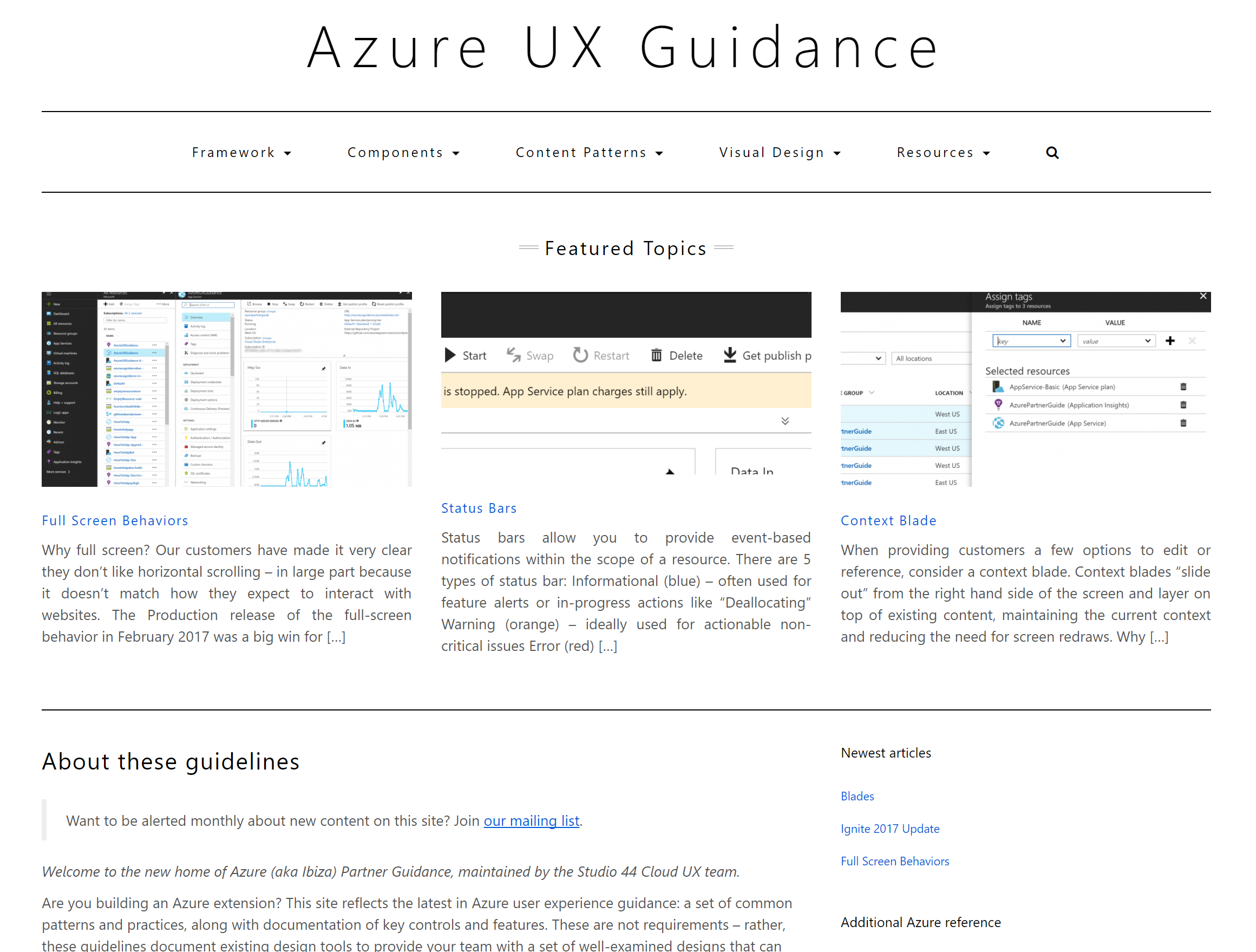
- Documented new patterns like context panes and status bars
- Expanded control guidance based on common questions from partner teams
- Added type ramp, color palette and basic control guidance.
- Expanded our responsiveness content with telemetry from the product and better layout examples
- Partnered with our program managers to identify best-practice case studies.


Guidance Round 3: Live Site
Usage of the guidance continued to grow, providing greater insight into what content proved most useful. Over the summer of 2017, I launched a new phase of the project: converting the content to a live site hosted on Azure, which would also allow the content to scale well past the limits of a single Powerpoint file.
As this documentation was intended for internal use, I optimized for expedience. I settled on WordPress as a hosting platform, and launched my own web server via Azure App Services. Before I could settle on a theme, I had to iterate on the information architecture of the guidelines site to ensure it worked well with the tools WordPress provided. I also spent time learning how to secure the site against external visitors, and how to instrument the site with basic telemetry.

Once the information architecture was settled, I chose a theme that allowed some restyling to use Microsoft fonts and some simple branding. From there, I updated all Spring 2017 content and doubled the number of topics based on feedback from partners. After review by fellow designers on my team, I launched the live site broadly one year after the first guidance release – in mid-September 2017.
Usage continues to be healthy – over 50 users a month, and over 200 unique users in the last 90 days, including holidays. Many of these views represent a designer or product manager who themselves will impact an entire product or feature. We no longer have to wait for semi-yearly guidance releases; errors and additions can be added on a rolling basis to the live site.


