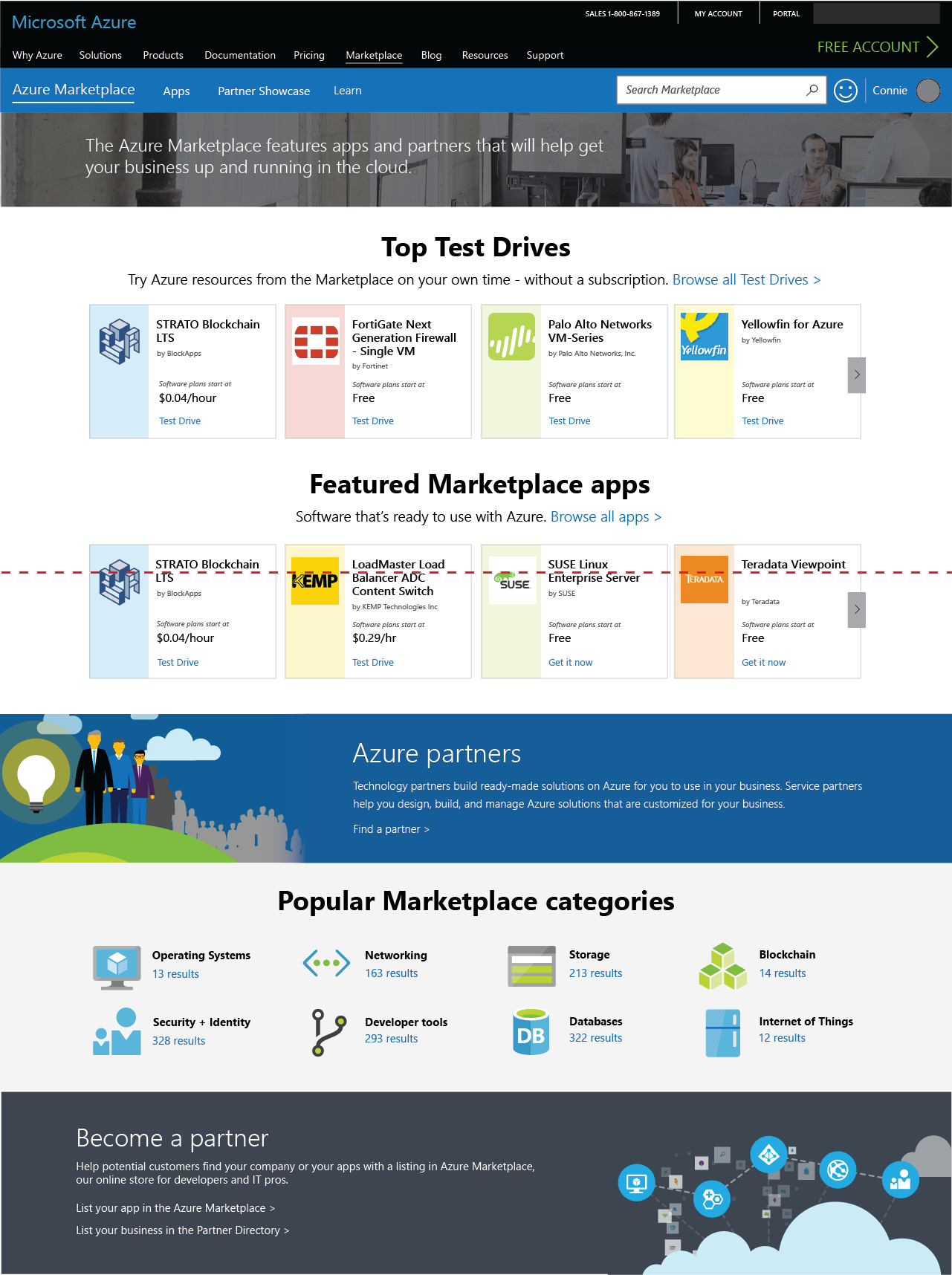
In early 2017, analysis of the AppSource.com telemetry revealed a potentially significant problem with the landing experience on AppSource.com, which was launched prior to my time partnering with the team. In partnership with our marketing and merchandising product managers, I worked to help both the AppSource and Azure Marketplace teams develop a roadmap for improving the landing experience.
Problem Statement
Since both AppSource.com and Azure Marketplace are driven by the same underlying marketplace framework, problems from both sites are indicated below.
- Customer satisfaction as measured from the home page on AppSource.com was extremely low
- Azure Marketplace lacked a home page, and the value proposition was unclear
- Neither site had a good way to surface quality product stories and blog posts, which were known to increase engagement
- Existing sites could not support Marketing merchandising agreements
- AppSource.com had search discovery issues, so a large part of their home page was dedicated to a second search box
- Neither home page was accessible, and snapping to Microsoft Web Framework controls would improve this
For this effort, I was the primary designer with assistance from another designer on my team during the later half of the process. I worked closely with a design prototyper and our research team, in addition to 3-4 product managers.
Round 1: AppSource Home
Ideation
 My partners on the product team were risk-averse when we discussed at the wireframe level, but were far more open to early discussions when centered around sketches. Thus, I focused on rough sketches to narrow down an initial testing plan, with the intent of fostering open conversations at the correct level.
Research and Delivery
After narrowing down our choices, we formulated a few core research questions:
- After viewing the home page, do customers understand the role AppSource plays as a MSFT software marketplace?
- Can targeted merchandising reduce the need for Search?
- Can customers who still desire to use Search find the core Search experience?
Our initial research based on an interactive prototype (which also included search and gallery functionality) indicated that the expanded merchandising and visual treatment for Search did result in increased engagement, but further affordances were necessary for category browse links that led to search results. We iterated and re-tested with several changes, and following a second successful test delivered redlines for the new AppSource Home Page.
Round 2: Pivot to Azure Marketplace
Around the time that we finalized the AppSource Home plan of record, project management decided that they would prefer to launch first with a homepage for Azure Marketplace, which was perceived as lower risk due to lower MAU.
While the exercise seems similar, the needs on Azure Marketplace were noticeably different:
- There was not a Search discoverability issue on Azure Marketplace due to a different header design
- The product categories and merchandising needs were notably different
- Azure Marketplace was positioned as part of Azure.com, whereas AppSource is standalone
- Azure Marketplace was tracking towards release of customer success stories, not blog posts
- Azure Marketplace was perceived as competing directly with the AWS Marketplace
For these reasons, we did not apply the AppSource home page designs directly, but did attempt to use similar components (drawing from the Microsoft Web Framework, which was then the plan of record to address responsiveness issues.)
Explorations
For these explorations, some of the design pivots:
- Placement of merchandising carousels
- Inclusion, placement and content of Marketplace value proposition
- Placement, emphasis and content in Categories section
- Inclusion and placement of customer success stories
- Link strategy (cross-linking to browse results/product pages
- Tile design
Research and Delivery
We continued to iterate on this design, validated it in several tests in parallel with gallery improvements, and scrubbed the design in partnership with our content designer. We were also unfortunately forced to use custom styling instead of Microsoft Web Framework controls, which caused responsiveness regressions that must be dealt with in the future once the team has dev resources to roll their own solution.


