When we launched the new Azure Marketplace in January of 2017, we initially adopted the category control from AppSource.com, both for consistency and expediency on our tight timeline.
After launch, however, customer feedback via verbatims and quantitative data began to suggest that our customers had a problem with wayfinding. The issue largely stemmed from the difference in information architecture between the sites. AppSource categories correspond to products and were more rigidly hierarchical, while Azure Marketplace categories had overlap and a less rigid hierarchy.
I proposed to the team that we begin an exploration of alternate filtering models, and the team agreed. However, the general desire was to explore broadly in hopes of finding a single control pattern that worked for both AppSource and Azure Marketplace, since both shared the same root code. Because the usability of filtering controls is heavily influenced by factors like response time, page animation, and usefulness of results, we felt it important to prototype heavily for this project.
MY ROLE: Solo designer.
TEAM: 1 design prototyper, 1 researcher, and 2 product managers.
Problem Statement
- Existing category browse controls were causing confusion and disorientation.
- Existing filter controls did not scale well for multiple filter categories, and ran well below the fold.
- Category information architecture behaved differently on different sites. Azure Marketplace had a more complex taxonomy.
- Product team was not willing to risk any temporary regression on the live site.
- Product team preferred a single control set for both Azure Marketplace and AppSource galleries
Prologue: AppSource.com Explorations
At the start, it seemed that AppSource would be our launch vehicle for new filtering due to a high development volume. In April and May 2017, the design team explored and eventually prototyped several new models for filtering AppSource. The first explorations I did focused on coarse layout options using controls from the Microsoft Web Framework (MWF) Library.
In an A/B test that compared a left panel with “accordion” collapsible sections and a horizontally oriented set of dropdown filters. Across 2 tests (n=8) the preference was for the “accordion” style MWF filters, which became our recommendation.
Round 1: Retest for Azure Marketplace
After we made those recommendations, the product team decided AMP was a more appropriate launch vehicle for new filtering as it was perceived as lower risk.
We decided to start by testing the AppSource recommendation in AMP.


Findings from Round 1 (n=3)
We found, to our surprise, that preferences did not match due to the differences in information architecture.
- The subcategory update was not immediately noticeable.This is a particular issue for AMP that didn’t exist in AppSource. The initial list of products is very small, so it was easy to see the subcategory when added to the filters. On AMP, the initial list of categories is very long, and thus problematic for this control.
- Ability to clear applied category filter from the left menu was not immediately obvious.This issue exists for all MWF Refine Menu selections, so we were not able to address this without major styling changes or new controls. It’s possible that eliminating the filter tags would actually make the left highlights more discoverable.
- Ability to search the filtered list or use custom filters was expected.This is not feedback on the particular filter design, but a site-wide feature request to change the relationship between search and filter.
Round 2: Iterative design and test
Based on the findings from the Round 1 test, I delivered 2 updated designs for prototyping in the Azure Marketplace context: (A) an updated accordion design with an auto-collapsing category group to help with the scale and scroll problem, and ()B horizontal dropdown filter controls as previously tested for AppSource.com.


Round 2 Research Findings
- There was a slight preference (3/5) for the horizontal filters (Option B) over the vertical filters.This directly contradicts the feedback from AppSource testing of horizontal filters, so we may be seeing a 50/50 split of subjective customer preference. Also, this particular finding was also split – so it does not immediately invalidate previous findings.
- The subcategories in the header of the horizontal filter page were not noticeable.The experimental placement of the subcategory in the header was not successful. Any future horizontal filter design will either need to add a subcategory filter or break out categories/subcategories into a different control.
- The subcategories in the vertical filters (Option A) were not immediately obvious.The auto-collapse behavior we introduced did not mitigate the feedback received in round 1 regarding the accordions. Verbatim: “Did not see the last 2 categories as it was below the fold. Would like to see the filters collapsed at first.”
Round 3: Additional iterations
We identified pros and cons of both options from Round 2, but our partner team was particularly unwilling to take on risk. We then doubled down on one more round of iteration to deal with the feedback from Round 2. Three options were identified and evaluated; 2 were tested.
- Round 3A: Categories became a navigational affordance, and I introduced a separate accordion control for filters. This did lead to an issue where the filters would change vertical position as the category list became a subcategory list.
- Round 3B: Categories are a navigational affordance on the left as seen in 3A, and filters are moved to a horizontal row above results. This exploration didn’t suffer from the same repositioning effects as 3A.
- Round 3C: An exploration where the header itself became interactive, allowing us to move category and subcategory selection there and reclaim some space. The left pane was used for a filter accordion.


Round 3 Findings (n=3)
- Subcategories were not very visible in the Hybrid model (Option B).
The prototype styling was notintended to be pixel-perfect, so this could partially be addressed as we move to high fidelity.
- Most users did not notice the Category filter on top in the interactive header model (Option C).
This could be solved partially by changing the default content for that control from “All” to “All Categories.
- There was a slight user preference for Option B (n=2/3).
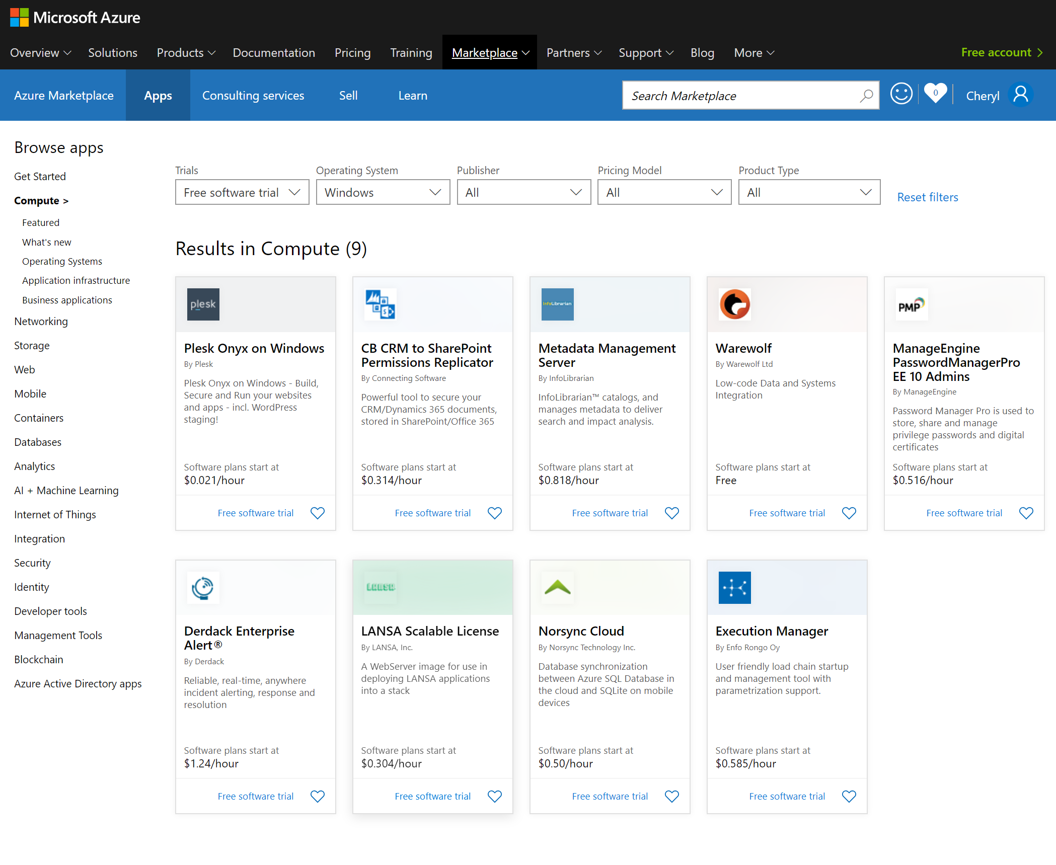
Results & Recommendation
These findings, paired with the fact that Option B was also viable in AppSource in May tests and was only ruled out due to preference, meant that our recommendation was to move forward with Option B. Final designs and redlines were delivered for the resting state, the category view, and the search results view.


During implementation, we learned that we could suppress the search tag behavior we inherited from AppSource. This streamlined the header and reclaimed visible space, without much regression since the design chosen places all filters above the fold.
As a result, the final implementation as seen at the Azure Marketplace:


